Work with tables in ADQM Control
The Tables page of the ADQM Control web interface displays information about data tables in an ADQM cluster connected to the monitoring system. On this page, you can view a list of all cluster tables with general information about them, switch to details on columns of an individual table, and also visually identify changes in sizes of tables using graphs.
At the top of the screen, you can set up the following filters to select which data the Tables page should display:
-
Cluster — ADQM cluster where data tables are located.
-
Time — time period for which information about tables should be displayed. In the window that opens when you click the field, you can select an interval from the offered options on the Range tab or set a custom time range (at least 1 hour) on the Calendar tab.
-
Refresh — frequency of data updates.
List of tables
The Tables page contains two tabs, each of which displays a list of ADQM cluster tables in a specific way:
-
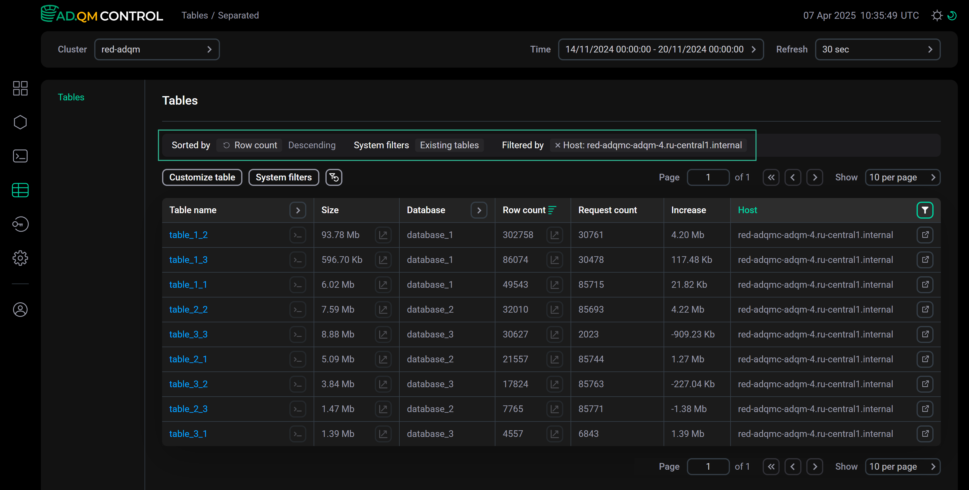
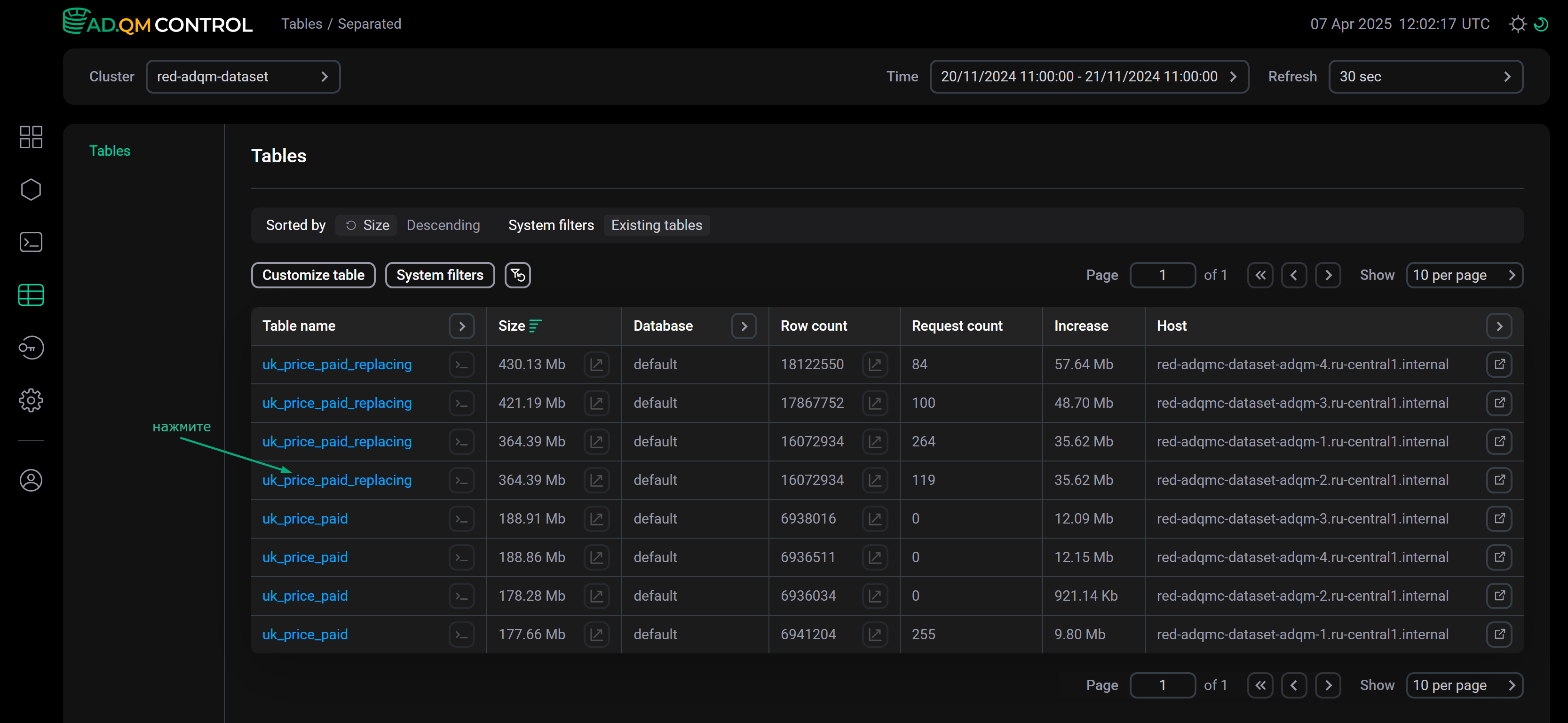
Separated — tables located on different hosts of a cluster are shown separately.
-
Aggregated — tables are grouped by table name, database name, and engine (that is, each table located on multiple hosts of a cluster is shown as one entry in the list).
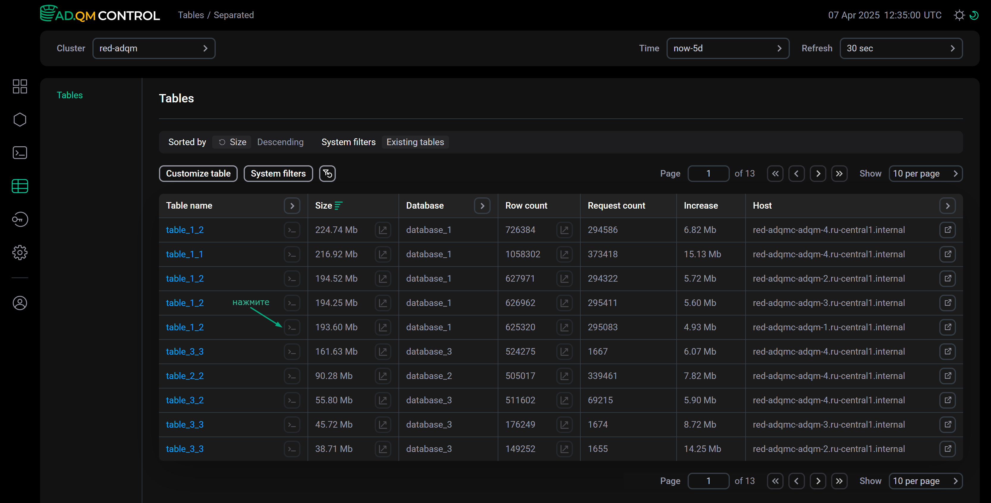
The Tables page lists data tables of an ADQM cluster as a table with the following fields.
| Field | Description |
|---|---|
Table name |
Name of an ADQM table |
Size |
|
Database |
Database to which a table belongs |
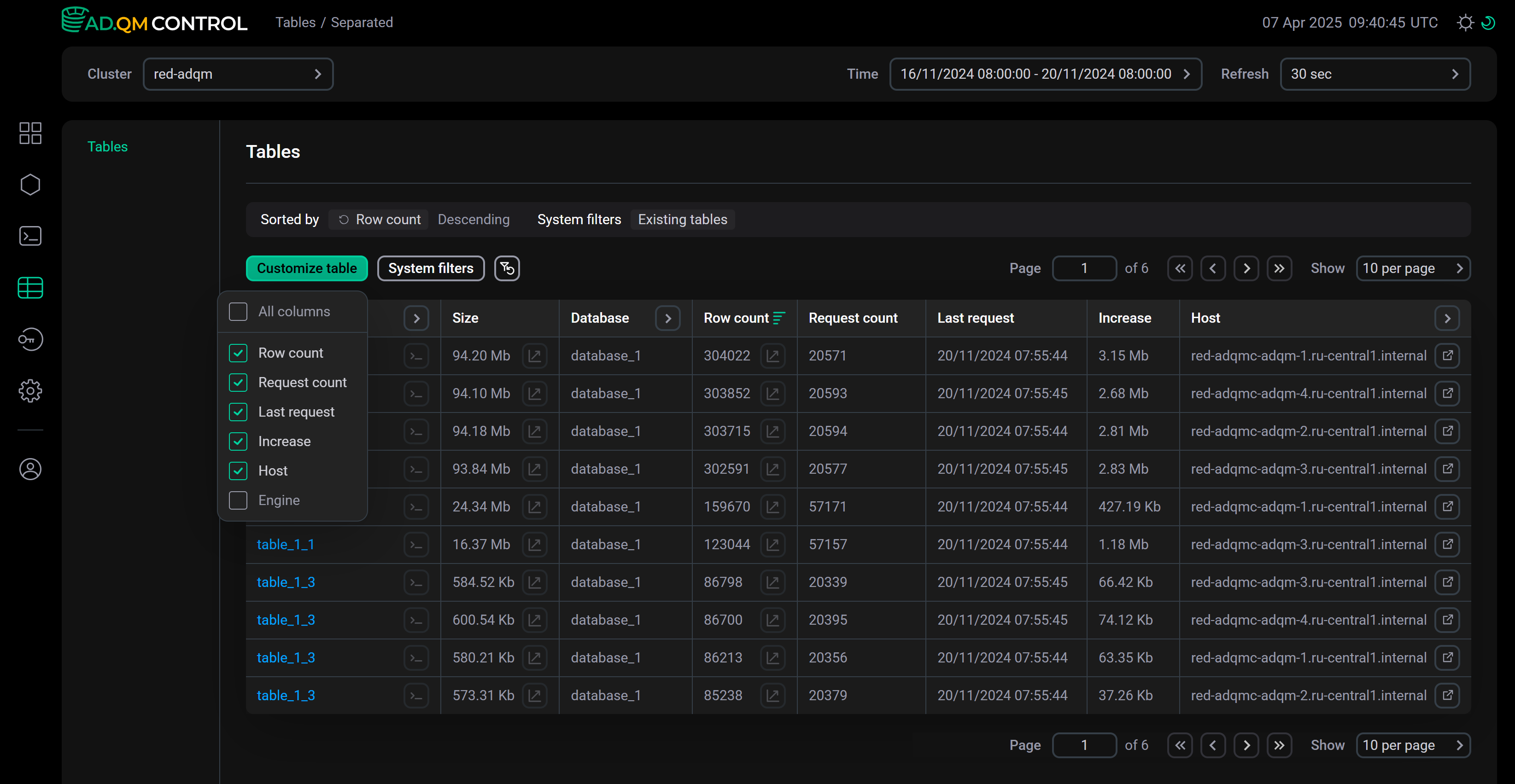
It is also possible to add more fields with additional information on ADQM tables — to do this, click Customize table and select the required fields in the drop-down list.
The Separated and Aggregated tabs provide different sets of fields for displaying metrics of ADQM tables located on specific hosts and aggregated tables, respectively.
| Field | Description |
|---|---|
Exist |
Table lifetime (since the start of monitoring the ADQM cluster in ADQM Control) |
Row count |
Number of data rows in a table on a host at the end of the selected time interval |
Request count |
Number of queries sent to a table on a host during the selected time interval |
Last request |
Time the last query to a table on a host was run during the selected time interval |
Increase |
Change in the size of a table on a host over the selected time interval (a negative value means a decrease in the amount of data in the table) |
Host |
ADQM cluster host where a table is located. Clicking on the icon |
Engine |
Table engine |
| Field | Description |
|---|---|
Exist |
Table lifetime (since the start of monitoring the ADQM cluster in ADQM Control) |
Row count |
Total number of data rows in a table across all hosts at the end of the selected time interval |
Request count |
Total number of queries sent to a table on all hosts during the selected time interval |
Last request |
Time the last query to a table was run during the selected time interval |
Increase |
Change in the total size of a table over the selected time interval (a negative value means a decrease in the amount of data in the table) |
Hosts |
Number of hosts on which a table is located |
Engine |
Table engine |
Size skew |
Data table size skew across different hosts |
Rows skew |
Skew in the number of rows in a data table across different hosts |
Requests skew |
Skew in the number of queries sent to a table to different hosts |
Size imbalance |
Imbalance in distribution of table data between hosts by data size. Values of imbalance metrics are in the |
Rows imbalance |
Imbalance in distribution of table data between hosts by the number of rows |
Requests imbalance |
Imbalance in distribution of queries sent to a table on different hosts. For example, for 4 hosts with a query distribution of |
Graphs
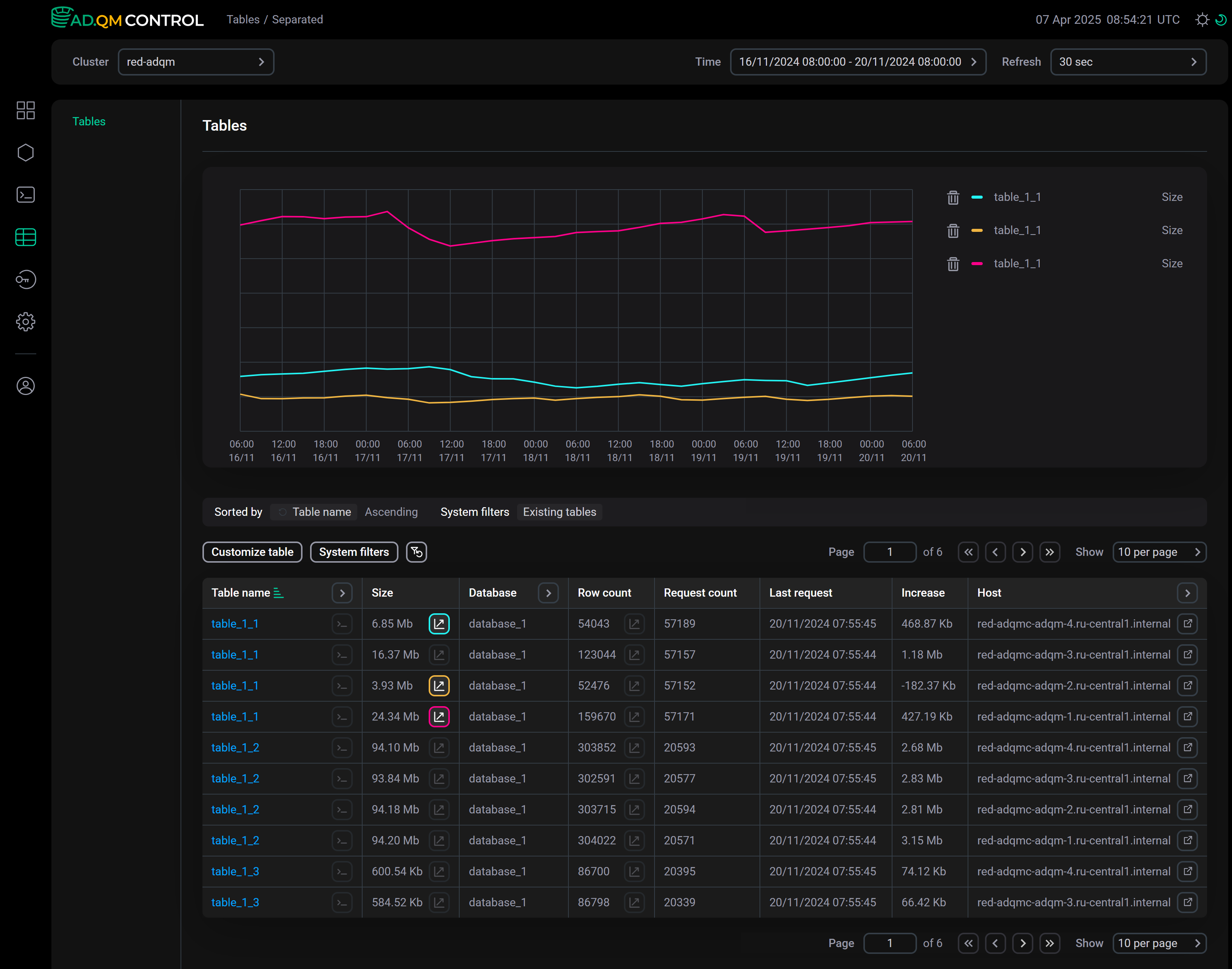
On the Tables page, you can get graphs to track the dynamics of changes in metrics of ADQM tables. In the columns of metrics for which graphs are supported, there is the icon ![]()
![]() . Click the icon — above the list of tables, ADQM Control will display a panel with a graph built based on the corresponding metric of the ADQM table. You can add up to 8 graphs (inclusive) simultaneously.
. Click the icon — above the list of tables, ADQM Control will display a panel with a graph built based on the corresponding metric of the ADQM table. You can add up to 8 graphs (inclusive) simultaneously.
To see values of metrics at some point in time, hover the mouse over the graph area. The Detalization option allows you to choose the level of detail (number of points on the graph): Low or High.
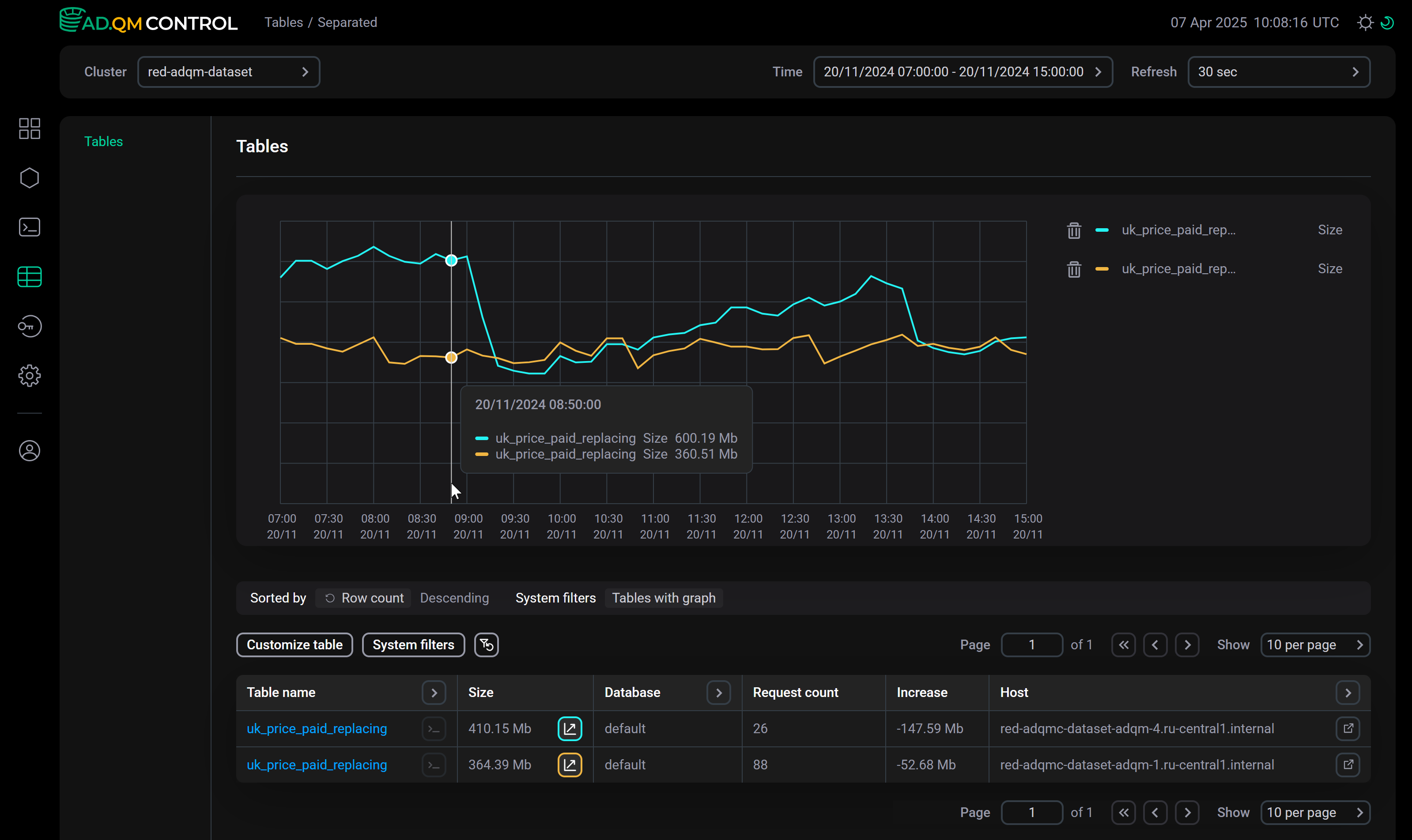
To delete a graph, click the icon corresponding to the graph color in the table (for example, ![]()
![]() and
and ![]()
![]() in the image above) or the icon
in the image above) or the icon ![]()
![]() in the legend to the right of the graphs.
in the legend to the right of the graphs.
Filter and sort data
In the Table name, Database, Engine, and Host (on the Separated tab) column headers, there are filters that you can use to select the necessary data on the Tables page. To set a filter, click the icon ![]()
![]() and enter a value you are looking for (a table/database/engine name or its part, or full names of hosts). The icon
and enter a value you are looking for (a table/database/engine name or its part, or full names of hosts). The icon ![]()
![]() means that a filter is defined for the column. To reset all filters by columns, click
means that a filter is defined for the column. To reset all filters by columns, click ![]()
![]() .
.
Clicking on System filters opens a list of predefined filters that you can activate with the switch ![]()
![]() :
:
-
Show system.tables — display ADQM system tables from the
systemdatabase; -
Only existing tables — display only tables that exist in the cluster at the last point of the specified time interval (tables for which ADQM Control received metrics at the end of this time period);
-
Only existing subtables (on the Aggregated tab) — to calculate data in a row corresponding to a group of tables, take into account only tables that exist in the group at the last point of the specified time interval;
-
Only tables with graph — display only the tables based on which graphs are currently plotted.
It is also possible to sort data on the Tables page by values in any column of the table with the list of ADQM tables. To apply sorting by a column, click the icon ![]()
![]() or
or ![]()
![]() in its header.
in its header.
Above the list of tables, there is a panel that shows the sorting (Sorted by) and filtering (System filters, Filtered by) conditions currently applied to data.
You can also view the list of the largest tables by data amount or the list of the most frequently queried tables in the ADQM cluster in the Top 10 tables section on the Dashboard page.
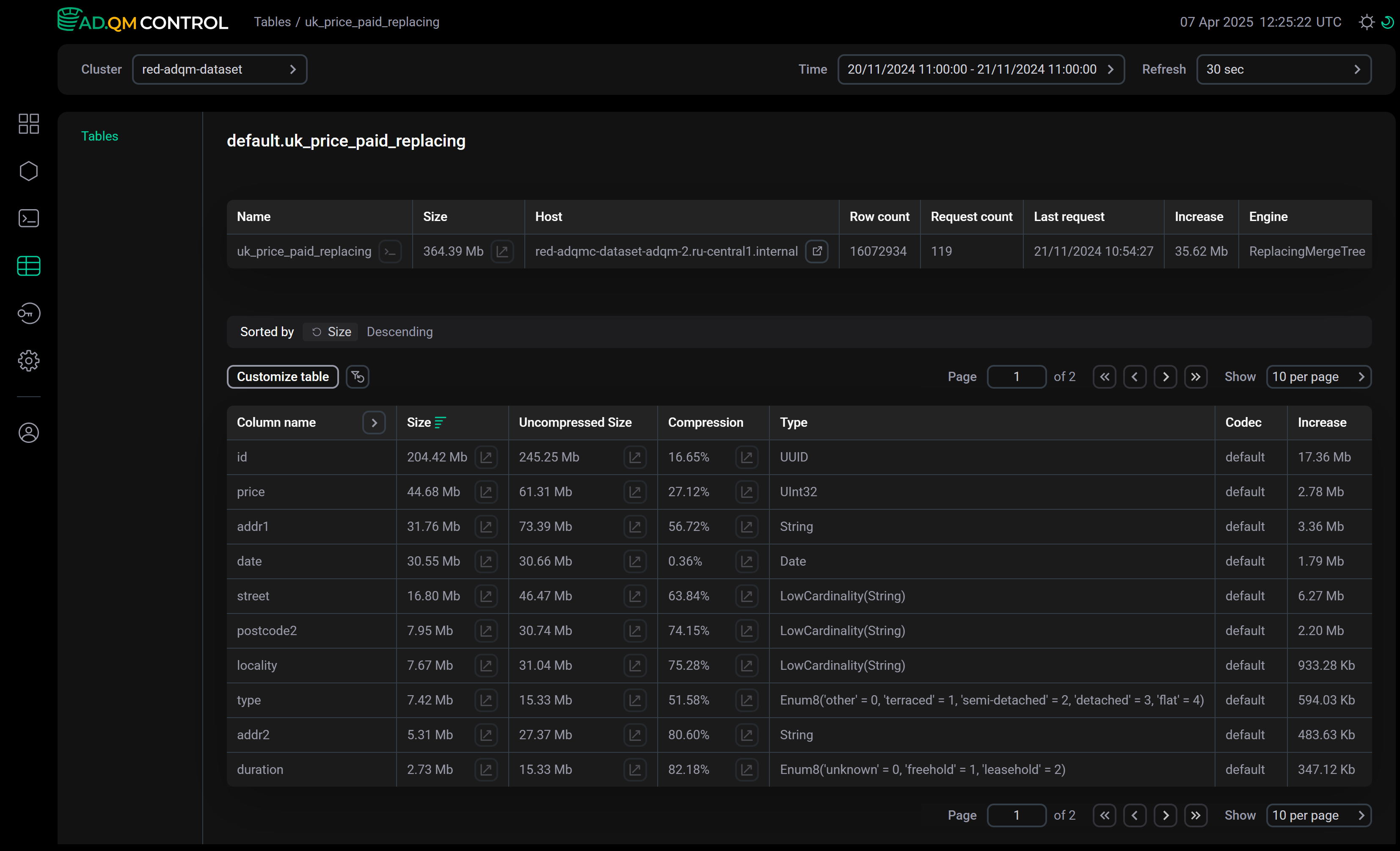
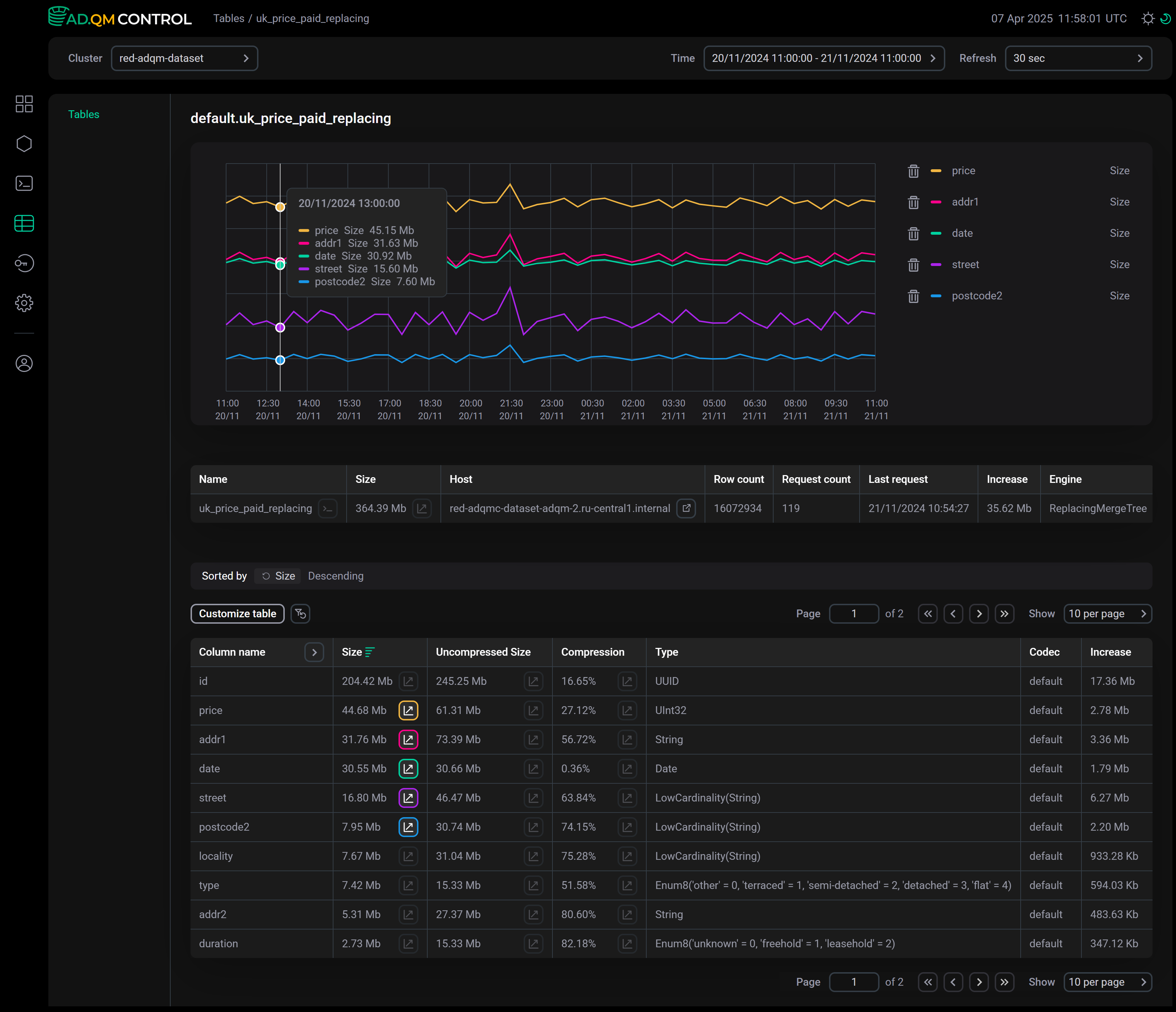
Table details
Open a page with detailed information about an ADQM table on a specific host as follows, depending on which tab on the Tables page you are navigating from.
Click a table name in the Table name column.
Click a name of an aggregated table (group of tables) in the Table name column — this opens a page with a list of tables in the selected group (with a full set of metrics as in the Separated tab).
Depending on the Only existing subtables switch state on the page that opens, the list includes all the group tables that existed in the cluster during the specified time interval, or only tables that existed at the last point in time of this interval. The top of the page displays general information about the group of tables (the same as the corresponding row on the Aggregated tab) — Customize table allows changing the set of metrics. On this page, you can also create graphs by metrics of individual tables from a group and metrics of an aggregated table. To do this, use the icon ![]()
![]() in the columns corresponding to the required metrics. The aggregated table graph is marked with the
in the columns corresponding to the required metrics. The aggregated table graph is marked with the Σ sign in the legend.
To go to the details of a table located on a specific host, click the table name in the corresponding row of the list.
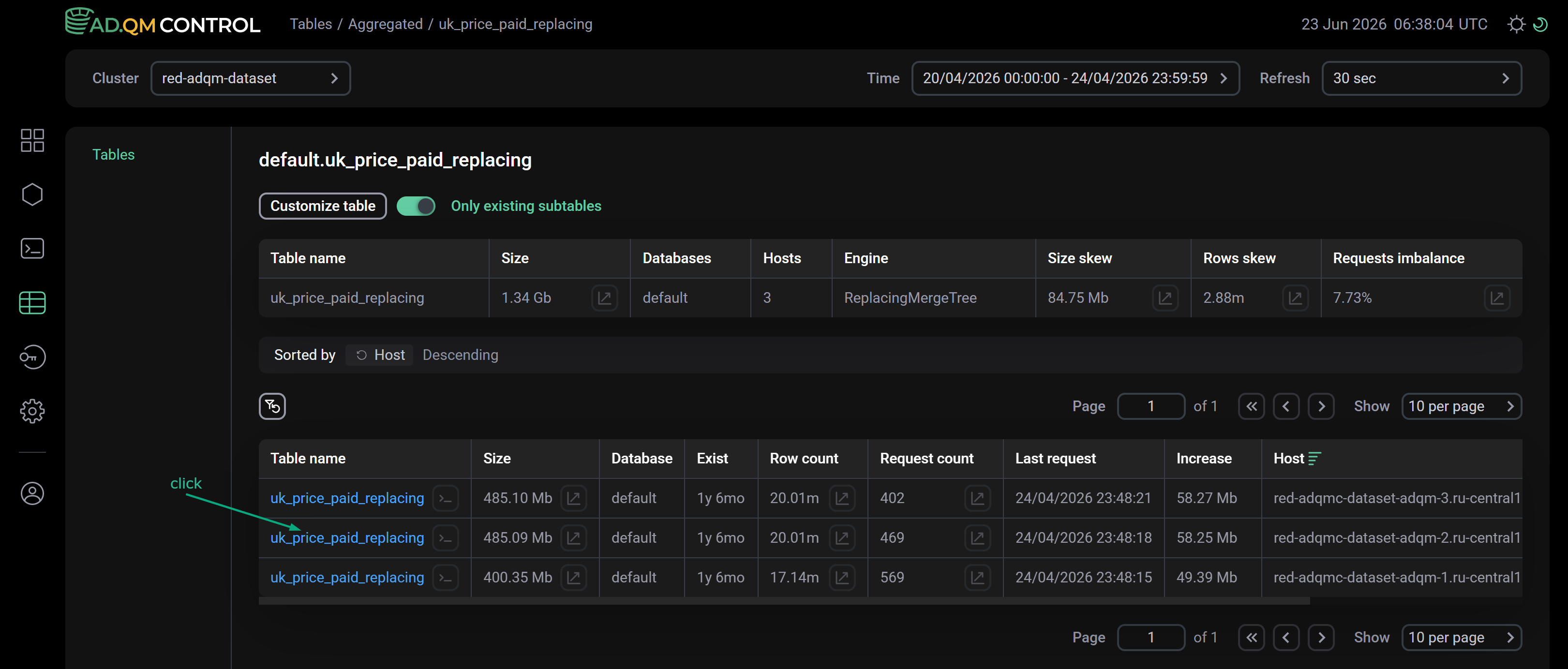
At the top of the page with ADQM table details, there is information about the table — its name and size, as well as the metrics selected via Customize table on the Separated tab.
This page also displays a table with the following fields that contain detailed information about each column of the selected ADQM table (to control the visibility of some fields, use the Customize table option).
| Field | Description |
|---|---|
Column name |
Column name at the end of the selected time interval |
Size |
Size of column data in compressed form |
Uncompressed Size |
Size of column data in uncompressed form |
Compression |
Percent of disk space saved by data compression |
Type |
Column data type |
Codec |
Data compression codecs applied to a column |
Comment |
Comment for a column |
Increase |
Change in size of column data over the selected time interval |
You can filter data in this table by the Column name field (to set a filter, click ![]()
![]() in the column header) and sort by any column except Comment (use the icons
in the column header) and sort by any column except Comment (use the icons ![]()
![]() and
and ![]()
![]() in column headers).
in column headers).
On this page, you can also build graphs to see how the size of compressed or uncompressed data in individual columns of an ADQM table changes over the selected time interval, or to analyze effect of applying data compression on the amount of disk space saved. To do this, use the icon ![]()
![]() in the Size, Uncompressed Size, or Compression column, respectively. The graph area can display up to 7 graphs by individual columns and one graph by the entire table size at a time.
in the Size, Uncompressed Size, or Compression column, respectively. The graph area can display up to 7 graphs by individual columns and one graph by the entire table size at a time.
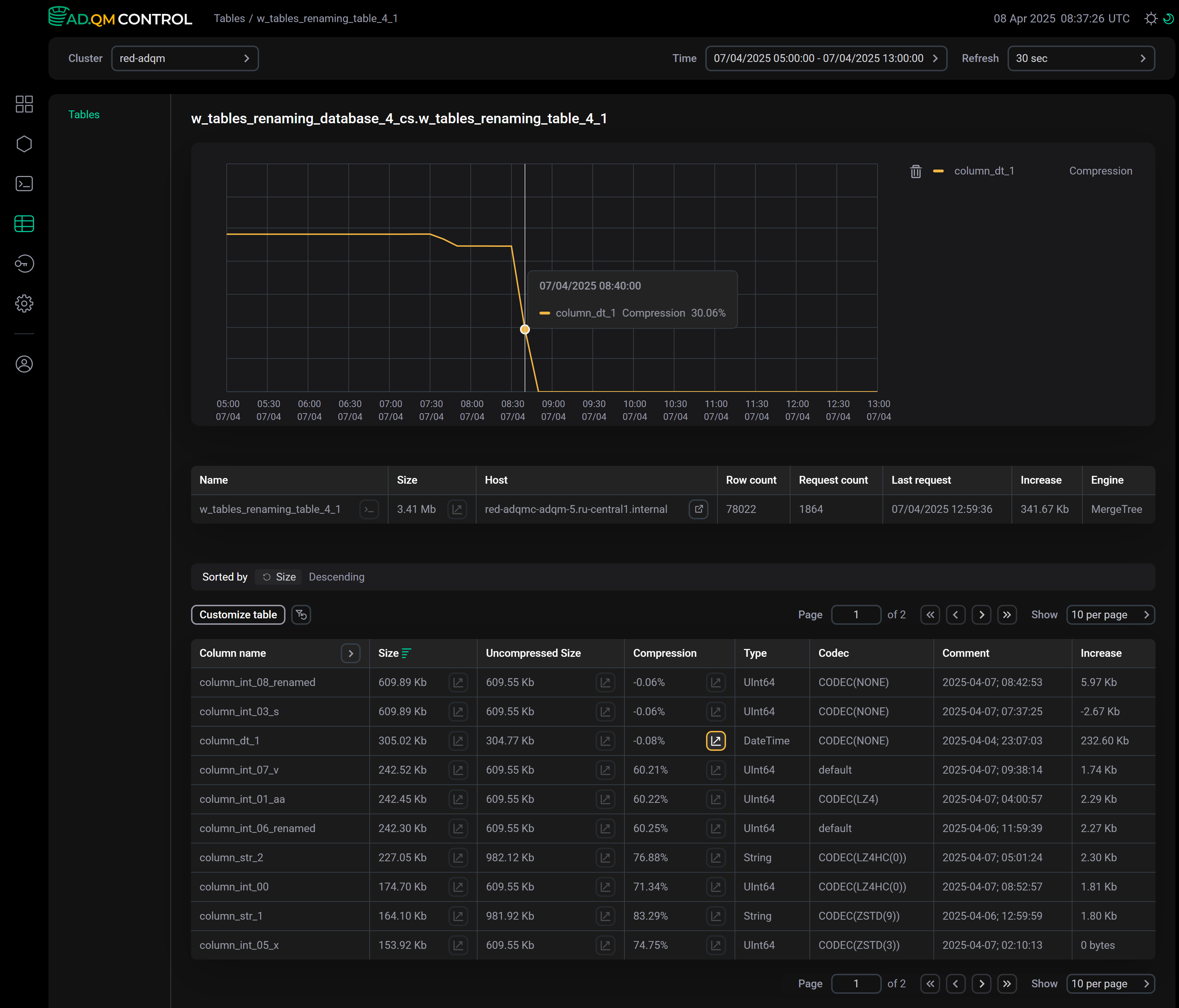
|
CAUTION
In the following cases, graph lines may be interrupted, which can lead to an inaccurate representation of column states and confuse users:
The rendering of graphs for such cases will be fixed in future releases of ADQM Control. |
Related queries
From the Tables page (as well as from the page with ADQM table details), you can access the list of queries sent to a specific ADQM table for a selected time interval. To do this, click the icon ![]()
![]() in the Table name cell corresponding to the desired data table — this opens the Queries page with automatically configured filters by table name, database, and host.
in the Table name cell corresponding to the desired data table — this opens the Queries page with automatically configured filters by table name, database, and host.